iTunes 11 is a radical departure from previous versions and nothing illustrates this more than the new album display mode. The headlining feature of this display is the new view style that visually matches the track listing to the album’s cover art. The result is an attractive display of textual information that seamlessly integrates with the album’s artwork.
After using iTunes for a day I wondered just how hard it would be to mimic this functionality — use a source image to create a themed image/text display.
The first step in replicating iTunes theming is obvious: getting the background color used for the track listing. This seemed easy enough, just use simple color frequency to determine the most prevalent color along the left hand side of the artwork. Doing a simple color count gives pretty good results, but looking at iTunes it was clear there was more to it than just that. I proceeded to add a bit of logic to add preference for colored backgrounds instead of just using black and white when those were the most prevalent colors. Doing this presents more interesting styles since seeing only black and white backgrounds would be a bit boring. Of course you don’t want to replace black or white if those colors really are dominant, so I made sure that the fallback color was at least 30% as common as the default black or white.
Once I started filtering black and white backgrounds my results started to get a bit closer to iTunes. After doing some more analysis I saw that iTunes also looks for borders around the artwork. So lets say you have a solid white border around the artwork picture, iTunes will remove the border and base its theming colors off the remaining interior content. I didn’t add this functionality as it was outside the scope of my simple demo application.
After the background color was determined, the next step is to find contrasting text colors. Again, the first thing I tried was simple color counting, this provides surprisingly good results but iTunes does better. If we relied only on color frequency you’d get variants of the same color for the different types of text (EG: primary, secondary, detail). So the next thing I did to improve the results were to make sure the text colors were distinct enough from each other to be considered a separate color. At this point things were really starting to look good. But what other aspects would need to be considered to ensure the text always looked good on the chosen background color? To ensure colorful text I also added a bit of code to make sure the color used for the text had a minimum saturation level. This prevents washed out colors or very light pastel colors from being used that might not give the best appearance. Now that the text had unique colors that looked good with the background, the only remaining problem was that the resulting text colors could end up lacking enough contrast with the background to be readable. So the last thing I added was a check to make sure any text color would provide enough contrast with the background to be readable. Unfortunately this requirement does cause a rare “miss” when finding text colors which then cause the default black/white colors to be used.
The end result looks something like this:
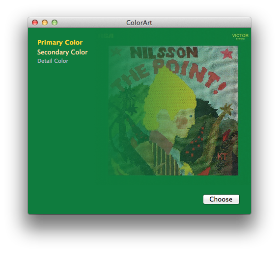
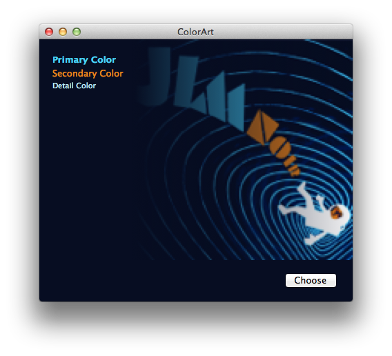
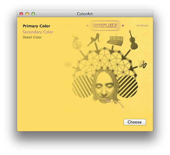
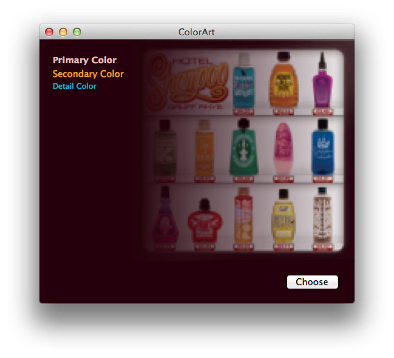
It’s not 100% identical to iTunes — sometimes it’s better! Sometimes just different — but it works pretty well overall.
You can see exactly what I did in the following Xcode demo project:
A few notes about this demo. I did very basic frequency filtering to prevent random colors from appearing as text colors. In my case I chose to ignore colors that only appear once. This threshold should be based on your input image size since smaller images won’t have as many pixels to sample from. Another processing technique that iTunes does, that I would also do if this were shipping code, is to look for compression fringing around the edges of the image. I’ve noticed a few cover art images that contain a single pixel edge of white/gray fringe that should be ignored and removed before sampling for the colors.
(Last but not least, this code was written in a few hours, and is very rough. So just in case you have thoughts about speed or optimizations, please note it was more of a thought exercise than a lesson in algorithm design. Engineer disclaimer complete.)
That being said, I hope this is somewhat interesting! It shows that with just a bit of work you too can have fancy themed designs too.
UPDATE: Thanks to Aaron Brethorst, this code is also now on GitHub.
 Ian
Ian
12/11/2012 11:12 AMNow if only this were possible to do online, I would perhaps give you my first born! Still some very spiffy work.
 Pixelmixer
12/11/2012 11:19 AMSure it can be done online. The primary technical need is the ability to sample pixel colors. This kind of thing is available to the HTML 5 canvas and for backwards-compatibility, Flash can do the same thing and return a set of colors for the color scheme. This is a pretty brilliant idea though, I’m glad someone tried to reverse engineer it.
 JiDai
JiDai
12/11/2012 11:20 AMExcellent ! As usual :)
 Brendon
12/11/2012 11:37 AMThis can be done on the web using php gd. It’s pretty easy to. I use this effect for avatar overflow
 George Hammerton
12/11/2012 11:38 AMWowzers trousers. This is brilliant! Thanks Wade, I’m going to have a lot of fun playing with this tonight.
 Tom
Tom
12/11/2012 11:42 AMVery interesting and looks great.
Snarky Tag: Have you gotten a cease and desist letter from Apple for patent infringement yet?
 Joel
Joel
12/11/2012 11:59 AMGreat work … and I’m very happy to see that Harry Nilsson made the cut!
 Matt Gaidica
12/11/2012 12:07 PMWe have been using a similar process at Landr for a while now to style content based on logo color. I have a demo, API, and some explanation of the [patent pending] process here: http://landr.co/brandr/ Maybe I can sue someone? ;)
 Steve Streza
12/11/2012 12:25 PMAwesome stuff! Is this available under an open source license (MIT/BSD/etc.)? All the code says “All rights reserved”. Thanks!
 Daniel Serodio
12/11/2012 12:28 PMAre you sure Apple doesn’t have a patent for this? :-)
 Charlie Leifer
12/11/2012 12:33 PMI wrote a post on this recently showing how I used “k-means” clustering to achieve a similar effect with python. Also on my post I have a javascript version that uses the canvas element. Might be of interest as an alternate approach.
http://charlesleifer.com/blog/using-python-and-k-means-to-find-the-dominant-colors-in-images/
 Matt Gaidica
12/11/2012 12:49 PMHa, maybe they do! Getting the IP was more academic than anything, and serves as a product/company/personal asset. My code is in PHP, and it’s not open source. Mainly because I am not happy with it’s cleanliness! It’s also something we like to think we do better than our competition.
 Tyler
Tyler
12/11/2012 1:00 PMPaperG wrote a good blog post about some sophisticated matching techniques they’ve developed for colors (for a different purpose.. to generate ads that matche the colors of a businesses’ logo).
http://www.paperg.com/engineering/how-to-pic-color-scheme/
Would be interesting to find out how your approach compares!
 Brad
Brad
12/11/2012 1:06 PMThis is awesome. I’ve wasted far too much time since iTunes 11 was released just checking out the background colors it picks for various covers and trying to work out the algorithm it uses.
I don’t think iTunes emphasizes the left edge the way your algorithm does. Albums with foreground elements along the left edge will usually get the right-edge background (e.g.: Alex Chilton’s “Set,” The Aluminum Group’s “Plano,” The Amps’ “Pacer”), though there seems to be a limit. “Set,” “Plano,” and Daniel Lanois’ “Acadie” all have a photo on the left and a strip of solid color along the right, but only on Acadie does iTunes grab the background color from the photo.
The “compression fringing” technique you mention goes further than the edge pixels, too. Covers with a solid margin of color on all sides will not get their background color from that margin, even if it’s pretty wide (e.g.: The White Stripes’ “White Blood Cells”). On the other hand, if the margins are on just two sides, they DO provide the background color (e.g.: Wilco’s “Being There,” XTC’s “Oranges & Lemons”).
I’ve come across some interesting cases, such as Blur’s “Best of Blur.” There are two versions of this cover: one with four solid-colored quadrants featuring cartoony images of the band and the other identical but with the band name in white across the middle of the cover. In the first case, iTunes picks the color of the upper left quadrant (which is also what ColorArt does). With the addition of the band name, though, it chooses white, which does not occur along an edge nor is it the most frequent color. Curious.
 Cabel
Cabel
12/11/2012 1:30 PMSteve: I’ve updated the ColorArt.zip archive — the source files now include a (very simple, attribution-only) license.
 Aaron Brethorst
12/11/2012 2:07 PMI took the liberty of extracting the interesting bits into a separate class and tossed the whole thing up on GitHub: https://github.com/panicinc/ColorArt
thanks for putting this together!
 SSteve
12/11/2012 2:10 PMOh man, The Point is one of my favorite albums of all time. Just seeing the cover gives me a powerful emotional response.
Cool project. I can see wasting some time with it over the next couple weeks if I can find some time to waste.
 Lukas
Lukas
12/11/2012 2:20 PMI have kind of ported your code to JavaScript/CoffeeScript. Awesome work!
https://github.com/lukashed/itunes-colors
 Vishnu
12/11/2012 4:00 PMThis reminds me of what Chrome does for the ‘Most Visited’ page… The border for each page’s “thumbnail” (if its small enough to call it that) is taken from the primary color of the favicon
 Mal Curtis
12/11/2012 6:03 PMThe guys at 99designs have written some great stuff on this too.
http://99designs.com/tech-blog/blog/2012/08/02/color-explorer/
 Dan
Dan
12/11/2012 7:41 PMImpressive! I’ve done the same experiment in JavaScript with HTML5 too. You may like to visit http://dannvix.github.com/ColorTunes for the demo.
 Ali Riza Esin
12/12/2012 2:33 AMGood work! Just for a contribution: This function (i.e. getting the artwork colors and use them as a complementary element for the GUI) was first seen (by me, at least) on “CarTunes Music Player” (http://cartunesapp.com), way before the one provided on the iTunes 11.
 Mohamed
12/12/2012 4:01 AMI think Windows 7 uses a very similar effect for its task bar icon glow effect
 Trance
12/12/2012 4:59 AMI really don’t like the background color because it affect directly the original artist cover. This is really ugly most of the time. The only positive is that itunes is now more responsive.
 Herman
12/12/2012 5:23 AMAm I the only one wishing he could hack the blur/fadeout out of this wonderful effect?
 Pat
Pat
12/12/2012 6:56 AMHerman, I feel the same – the faded border looks cheap and does not go together well with the elegance of the color matching effect.
 Pat
Pat
12/12/2012 6:58 AM… and with some covers, important parts are cut away by the blur.
 Daniel
12/12/2012 7:38 AMI’ve been working on my own version of this too. About to check yours out!
 Thomas
12/12/2012 9:12 AMI posted a web version today too! http://thomaspark.me/project/expandingalbums/
 Cristofer
12/12/2012 1:29 PMI’ve found that some albums on iTunes 11 have text colors that are much too saturated. Perhaps there should also be an upper limit for saturation.
 Alex Dergachev
12/13/2012 10:20 PMJust came across another canvas-based example of this: http://albumcolors.chengyinliu.com/examples/lastfm/?lastfm=willowm
 Paul
Paul
12/14/2012 12:17 AMDoing something like this in my iPhone app phonetrait. I am adapting the UI color to the contacts picture.
As soon I have time, I’ll need to compare your algorithm and mine.
 Matt
Matt
12/14/2012 10:55 AMNice write up. For comparison, http://colorhits.com takes this beyond background colors with full iTunes API color searching of album art as a music discovery service.
 Ilija
Ilija
12/16/2012 8:36 AMYou should scale down the image to 64×64 pixels, I went down from 2 seconds to 0.03 seconds ;)
 posh
posh
12/16/2012 5:28 PMthe modal colour of the left hand edge is what i would’ve assumed too, until i saw what they did with “sea change” by beck. almost the entire left hand edge of that album cover is white, and the right hand edge is pink. the overall modal colour is pink, and itunes makes pink the background. there’s some really complicated stuff going on there
 Mark Jaquith
12/16/2012 5:59 PMIf you’d like to do this for a website, check out the code of the Duotone theme for WordPress, which was doing this three years ago!
 powers
12/16/2012 6:09 PMExcept now I can’t add my own album art for stuff that’s not in the iTunes store, or at least I havn’t been able to figure it out yet. But very cool feature.
 Fofer
Fofer
12/16/2012 6:32 PMpowers: Select the tracks in Songs view, use Get Info to bring up the multiple-track info view, and then copy and paste the .jpg into the little “Artwork” square.
 Larry S
12/16/2012 6:35 PMThis is pretty interesting. I was wondering how it was done and was thinking of “borrowing” the idea for a website. Lucky for me I’ll control all the content it displays so it may be easier. This does give me some ideas though.
I wonder if it is all programmatic though or if they tweak anything for more complex covers.
 james white
12/16/2012 9:22 PMOne thing I wish they would do differently. If the imagery doesn’t bleed off the edges, it doesn’t need the fading effect – the edge can merge seamlessly into the detected background colour.
So your Shaun Lee example has artwork centred on a yellow background. This doesn’t need the fade, and would look much better without it. Looking through my library, there are many, many examples where this would be the case.
Relatively easy to implement too, I would have thought. If there is a solid line of similarly coloured pixels along an edge, don’t fade.
 Raphael
12/17/2012 1:55 AM@powers, @Fofer: You could also use a proxy to intercept when iTunes requests artwork for albums. That way, you won’t blow up your music files. I’ve implemented such a proxy: https://github.com/sabberworm/CoverArtProxy.
 Oyvind Solstad
12/17/2012 5:40 AMThe WordPress theme Duotone already does this: http://theme.wordpress.com/themes/duotone/
 George
12/17/2012 9:06 AMHow well does this work for the White Album, or the Black Album? :-)
 Greg
Greg
12/17/2012 4:34 PMSeriously – this is my favorite part of the new iTunes. As a photographer and graphic designer I have been delighted by it and spent waaaay to much time checking what choice iTunes would make for a given album and guessing what it might do. Even spent a bunch of time at work with another designer marveling over it. Love it. I would love to hear the background story to it. Delighted that you decided to try an reverse engineer the whole thing. You are so much smarter than I am – kudos. respect to you.
 Mike Fiorillo
12/17/2012 4:42 PMI love this effect… was the first thing I noticed about iTunes 11.
 Yaniv Eidelstein
12/20/2012 1:31 AMI noticed something more sophisticated at play… Check out this screenshot of a Duke Ellington album cover in iTunes. Not only is the background extended to the text display; the artist name, year and track times are shown in the same color as the font in the album cover!
http://d.pr/i/vgri
 Shahar Nechmad
12/20/2012 11:31 AMVery cool! Thx for sharing.
Anyone ported this code to iOS? Tried to play with it but didn’t get the same results.
 Ilija
Ilija
12/21/2012 10:39 AMI forked your project and implemented some new features, a few bug fixes, and huge performance boost.
I’d be happy if you could take a look:
https://github.com/iluuu1994/ColorArt
 chaingarden
12/22/2012 12:31 AMShahar, I found this project that does the same thing on iOS: https://github.com/fleitz/ColorArt
 Scott
Scott
12/28/2012 5:11 AMFantastic work. The iTunes look is brilliant, and now it’s available to everyone! Very cool.
 Stan Makrinos
1/2/2013 7:41 PMSimilar feature exists on windows 8 – (Control Panel-Appearance and Personalization – Personalization-Color-Automatic) If set to “Automatic” then all windows colors change to whatever the wallpaper image has.
If one selects a series of wallpapers to change every set interval then all windows match their colors.
Pretty cool effect.
 aaron1266
1/5/2013 4:37 AMJust imagine this: When I want to listen to a song, I just look up the track number in the album and then I select it. No more. Then I go and sit or do anything else. Why on earth should I look into a image four minutes?. If my music collection goes to the hundreds of albums Im not happy to navigate in hundreds of covers; I remember NAMES or track names to be able to look up… Nevermind. It’s useless to speak of SOUND to people who want images… By the way, I’m a graphic designer who by no way miss the point between audio, video or graphics.
 BF1
BF1
1/7/2013 12:08 PMHow could I use this code to create an itunes visualizer so that it would basically look like a full screen version of the albums extended view?
 jk
jk
3/7/2013 1:52 PMwow! I just received an iTunes card pin number for free from this site freeitunesforever[dot]com :D
 Roger
Roger
3/8/2013 1:16 AMiTunes also seems to overlay a ‘wash’ of the background colour over the image, and blue the edges to improve the blending
 e-papierosy
3/13/2013 7:46 AMSo your Shaun Lee example has artwork centred on a yellow background. This doesn’t need the fade, and would look much better without it. Looking through my liquidy library, there are many, many examples where this would be the case.
 Louis
Louis
3/19/2013 7:41 PMChalk me up as someone who loves the automatic coloring in iTunes, but hates the fade. I wish there was some simple way of changing that.
 bazso
bazso
3/25/2013 11:04 AMhttp://git-m.virgo.hu/colorartphp
our version in PHP based on this solution
 shogun
3/30/2013 8:02 AMi reckon the idea of individual color themes is great, especially if it works, which it does 99% of the time — what’s annoying is that if one deactivates this function, one no longer has a large cover displayed and what’s more, the blurry frame is absolutely grotesque and detrimental to any cover experience which is as important as is the last song on the album. the big issue about the main color being faded INTO the cover on the (NOT AT ALL insignificant) edges is made quadruple times worse by SHADING THE MAIN COLOR ACROSS THE ENTIRE COVER !! some may call this blasphemous or sacrilegious — definitely reprehensible and totally out of order !!
me need solution tooo!!!!!!
thanks to all who support the improvement of this well intended, but failed idea!
 Mon Tolentino
5/20/2013 6:32 AMCAN I USE THIS CODE TO MAKE A VISUALIZER? PLEASE HELP. HOW ABOUT WINDOWS VERSION :((