During research for the Panic 1982 Box Project, Cabel and I came across a unique Package Design Time Paradox: game boxes, made over 20 years ago, that look as if they could have been designed yesterday.
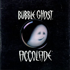
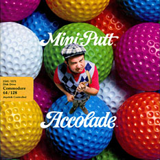
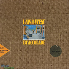
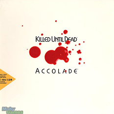
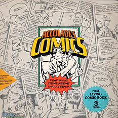
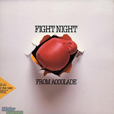
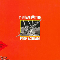
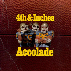
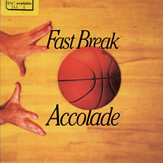
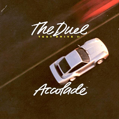
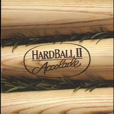
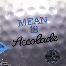
For the game developer Accolade, the period between 1984 and 1990 marked a serious and unbeatable streak of awesome. We’re talking bold, timeless art; none of this so-bad-it’s-good nonsense. Click ’em:
It’s obvious that all these games are from the same company, and yet the variety of illustration/photo/type styles is fabulous. That Killed Until Dead image: how understated and powerful is that? Who does that sort of classy thing with video game covers anymore? (No, really, who? Please feel free to tell us!) Take heed: the simplicity and clarity of these boxes has given them eternal life.
Note also that since these are very design-y, often abstract covers, there’s less potential for Box Disappointment™. I mean, Mr. Grumpy obviously won’t be there in photographic flesh when you fire up Mini-Putt; no one expects that. But his curmudgeonly spirit will be, regardless of how many pixels he’s built of. That’s what a product box should ideally do: make the product more badass.
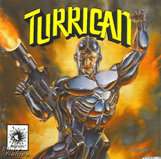
Unfortunately, right around 1991, as Accolade began to hire Boris Vallejo as a cover artist, things became… a little too much badass. And a whole lot less timeless.
You had a great run, Accolade. I wonder who the art director was?
(All images found at the invaluable MobyGames.com. Oh, how many nostalgic hours we’ve spent there!)
 Sebastiaan
2/18/2010 11:20 AMBeautiful indeed. I was unaware of such a period in game cover design, and it’s a sad thing that it has disappeared.
 Fred
Fred
2/18/2010 11:26 AMDear Panic,
Just letting you know that your blog posts are slightly crooked.
Love,
Fred
PS: SO COOL!
 David
David
2/18/2010 11:28 AMI almost don’t believe you. Those are too nice to be game covers. :-)
 Lucius Kwok
2/18/2010 11:31 AMIt’s not just Accolade, but many of the retail boxes for software were great. I think it’s just when a company transitions from a generic floppy-in-a-bag to their first real boxes, and they don’t have a marketing department telling them what sells the most boxes, you can have artists do great stuff.
 Daniel Jalkut
2/18/2010 11:32 AMIt really is fascinating how modern those all look.
 Wilson Miner
2/18/2010 12:10 PMOh man, The Duel was an amazing game. I can still see the paper-thin trees whooshing by from behind my hyper-realistic 1-bit Porsche dashboard.
 Eric Peacock
2/18/2010 12:28 PMThese are great. Graphically interesting, easier to digest, unique and completely on-brand. Also a great one for packaging was Infocom.
That Turrican box stylistically reminds me of Cabel’s classic 2007 Learn Forth post on his blog: http://www.cabel.name/2007/01/blog-bits-001.html (cabel’s archives are 404’ing from the popup menu, so this is the best I can do)
 Matthias Schonder
2/18/2010 1:01 PMI not only love the covers but also the games…
Test Drive and Test Drive 2 are one of the greatest racing games I ever played.. Especially the Scenery disk.. When I played (and I still play it from time to time) California Challenge I can smell the sea.
 Chris
Chris
2/18/2010 2:36 PMI had about half of those on my IIGS. Good times…
 Stormchild
2/18/2010 2:43 PMNice! I hadn’t seen these ones before.
 Benjamin Chait
2/18/2010 4:10 PMAs Fred dutifully noted, the page seems to be on its side. Took a moment of reading before I realized that no, it wasn’t me. And yes, my head was slightly turned in an attempt to see clearly.
:)
 Scott Reeves
2/18/2010 5:01 PMWow. Panic, you are my new favourite blog. Design and content are both top-notch.
 Steven Hambleton
2/18/2010 8:43 PMI’d like to vote Ultima VII as one of the best game covers ever. You could literally feel the evil.
http://media.strategywiki.org/images/b/b3/Ultima_VII_Black_Gate_box.jpg
 room34
2/18/2010 9:24 PMI love it!
After my big Atari 2600 phase, my parents refused to buy me an NES like my friends all had. Instead, they bought me a Tandy 1000 computer (MS-DOS 2.11 baby!) and I spent the latter half of the ’80s playing the hell out of every Accolade game I could get my hands on. I remember loving the box art, too, but it’s been 20 years since I’ve seen it. Thanks for the memories!
 Than
Than
2/19/2010 2:43 PMOh how I loved playing Hardball on my dad’s Mac Plus. Someday I’ll pull that thing out of the storage closet and try to get it running.
 Marty Plumbo
3/1/2010 5:18 AMI like the old Synapse 8-bit game covers – a lot more stylized, but they game the Synapse product line a real personality. And talk about evocative – in an age when game box art was generally more visually exciting than the graphics in the actual game, they were a great departure point for your imagination!
 Justin Reese
3/4/2010 11:57 AMGorgeous!
It’s interesting that in every one except the Accolade’s Comics and Mean 18, they ensured the byline was the same width as the game title, whether through some super-kerning (Killed Until Dead) or adding By/From. Really provides a beautiful symmetry. And the two exceptions had good reason, mimicking real-world counterparts.
Yeah, that’s superb.
 Justin Reese
3/4/2010 11:59 AM@Fred and Benjamin: http://www.zachstronaut.com/posts/2009/02/17/animate-css-transforms-firefox-webkit.html
 aeiowu
3/6/2010 8:29 AMmaaaaan, my brother and I were huge into hardball II and III. Accolade made some quality sports games before EA took over most of the market share. :)
 Pak-Kei
3/8/2010 7:56 AMA lot of Japanese games still have pretty classy covers. Take a look at the Final Fantasy series… the Japanese ones, not the American ones. For some reason, everything gets f-ed up, amped up to the 11 unnecessarily, when it moves across the Pacific.
I also like the SIM game covers before Maxis was acquired by EA. Back then, from SIM City 2000 to SIM Golf, they all have a coherent style and package. I collected them all!
 GDS
GDS
3/10/2010 9:44 AMSuch memories. I went the C64 -> Amiga path, and I remember ALL of these covers from ads in the Commodore-centric magazines from those days. I owned about a third of those games and, yes, the slightly abstract nature of the cover art probably made the gameplay/ownership experience better by not narrowing one’s expectations.
 Chester Schendel
4/27/2010 4:14 PMI distinctly remember every one of these covers on the store shelves when I was growing up. I even owned a couple of these games. Thanks for sharing these.
 GameScanner
10/23/2010 2:47 AMTrue, true, Old video game covers had great covers made by artists full of ideas. These days all cover is mostly digital or CG. There was magic in them. From the ones mentioned “Fight Night” sends the message! And artwork by Mr. Vallejo is truly amazing… at times. Didn’t know that he designed the Turrican box cover art.
 StephenG
4/7/2014 5:55 PMIndeed, I’ve always like Accolade’s art covers in the early years. It’s very interesting that other gamers appreciate the style too.
 Sharlene Raskin
2/5/2016 1:01 AMPractical blog post – Coincidentally , if your business are interested in merging of PDF or PNG files , my boss encountered a service here http://goo.gl/35Kkcl